


»
Clashing the classic with the innovative
«
When Kungliga Operan set out to renew its visual identity, the ambition was to honor its heritage while speaking to contemporary audiences. Stockholm Graphics developed a bold brand identity and tonal framework, clashing the classical with the innovative. Over more than a decade, the identity has been developed across campaigns, digital platforms and communication – built for longevity.
We make all of the parts of the campaign: from the conception of the idea until the launch of the concept. For example messages, design and copy for ads, posters, banners, digital flyers and Facebook events.
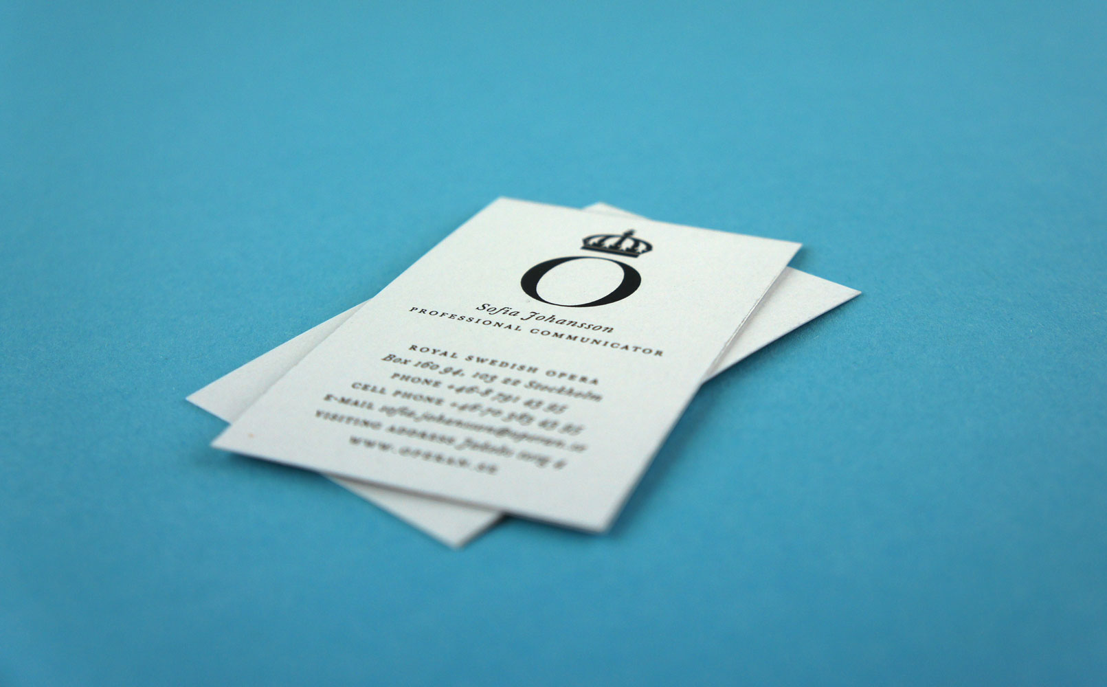
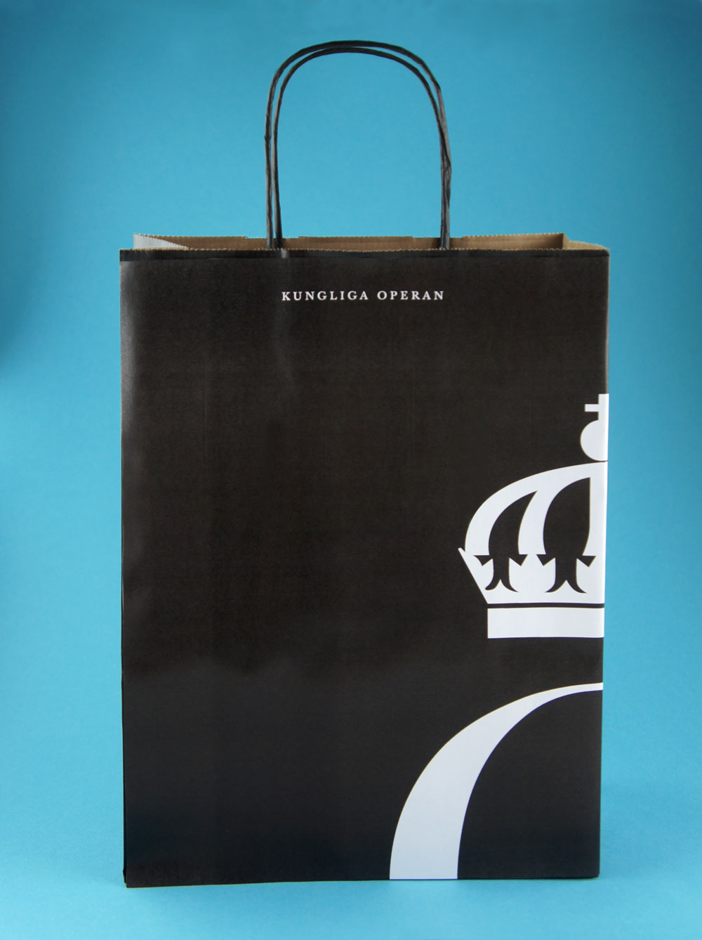
Each piece of communication became part of a single story — one that connected the Opera’s legacy with its audiences today.
Each piece of communication became part of a single story — one that connected the Opera’s legacy with its audiences today.
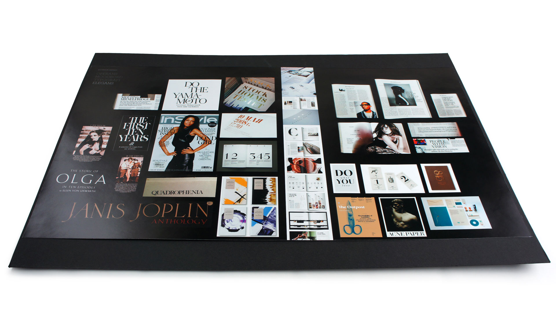
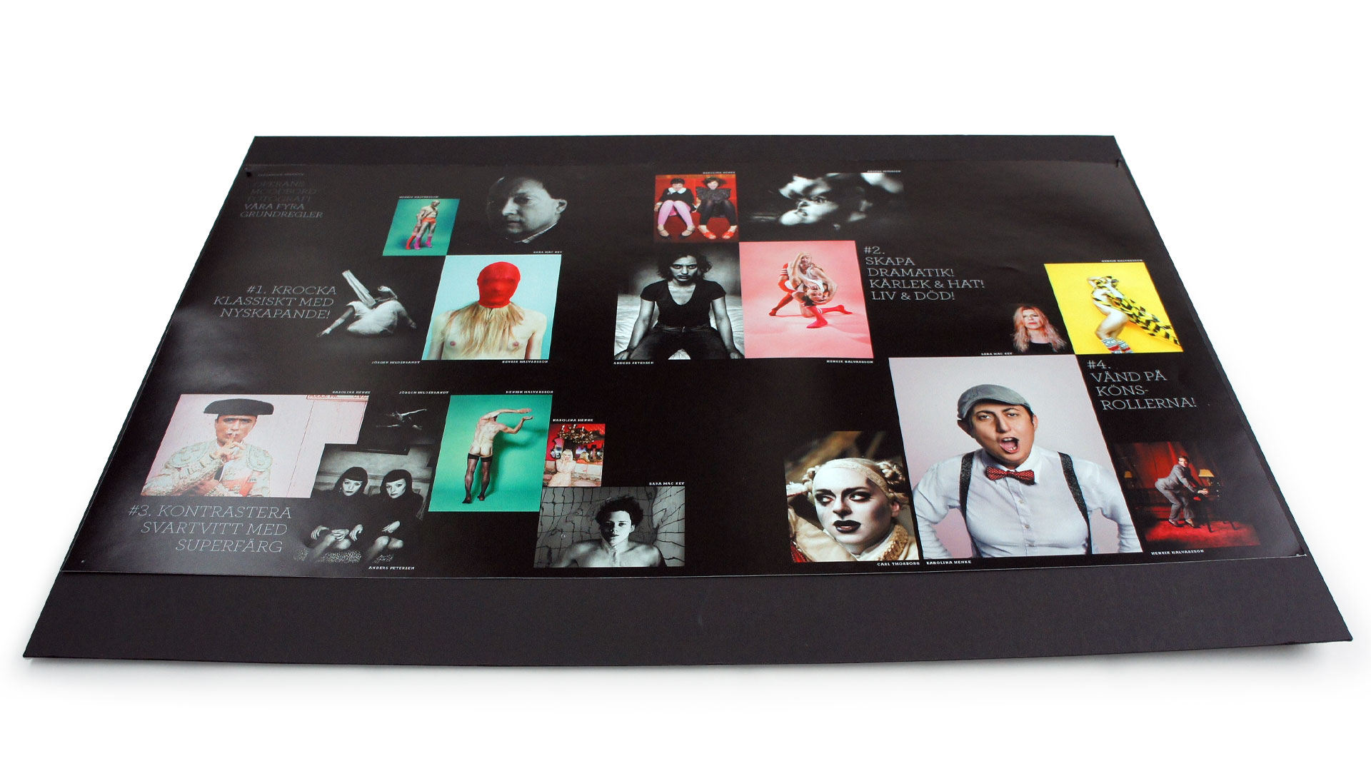
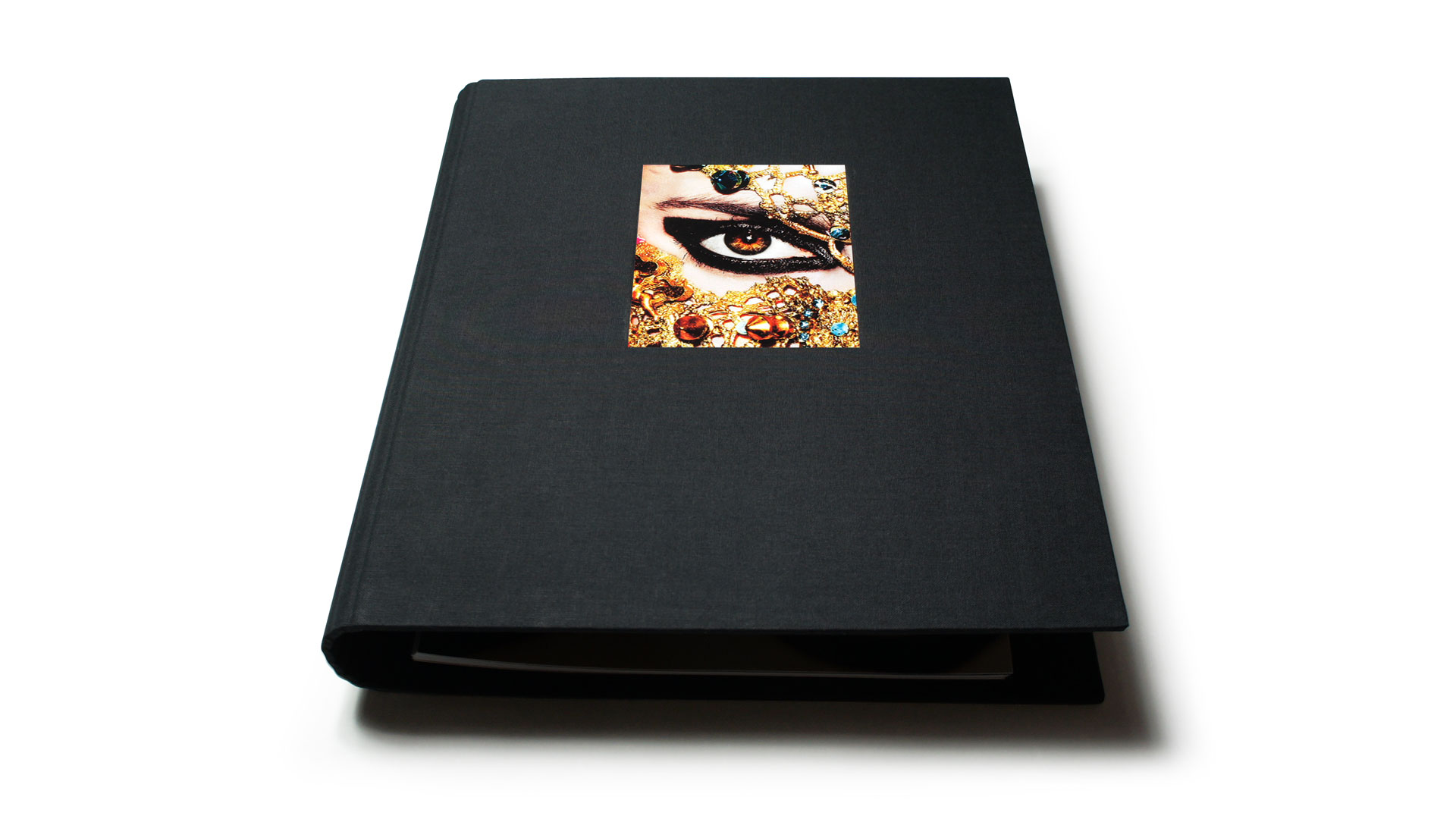

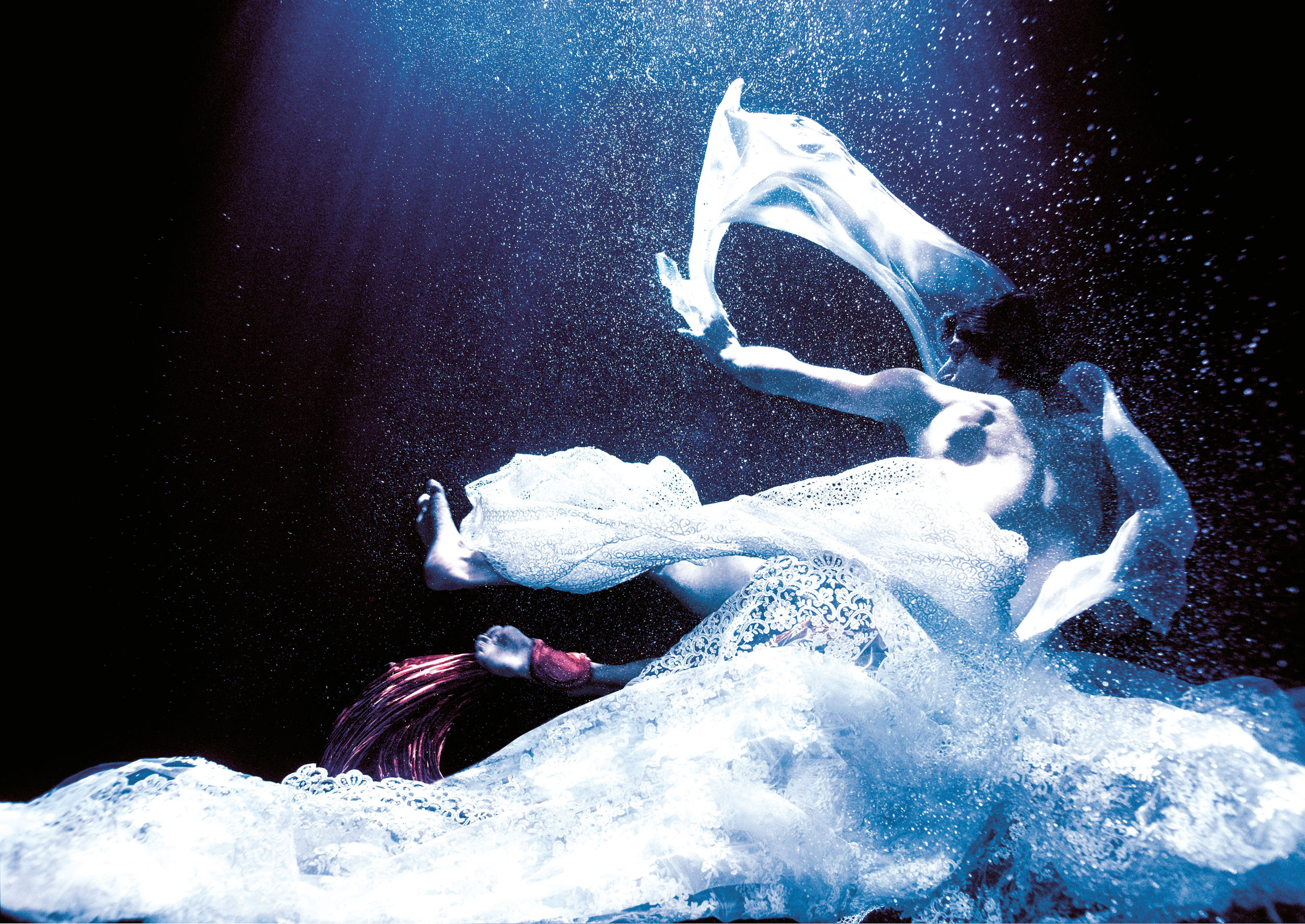


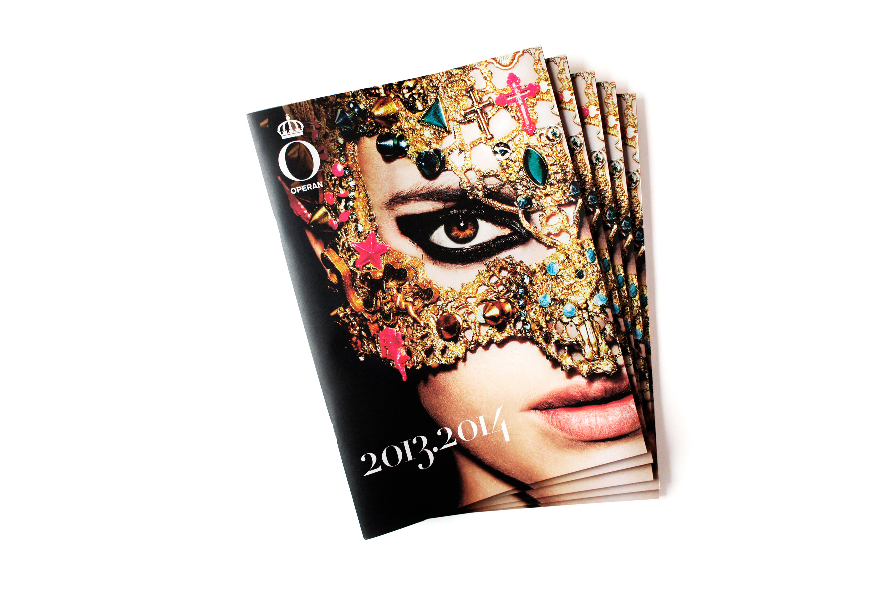
An excellent customer- and member magazine strengthens the identity, drives engagement and conveys a message. We work with the best writers and photographers in the country and manage the project from the first editorial meeting until the magazine is hot off the printing presses. Have a closer look at the Swedish Royal Opera’s magazine under the header »Magazines«. Below you see Creative Director Pompe Hedengren’s sketches for one of the larger photo jobs.